
Pinky Berry Cafe is a concept project envisioning a vibrant and trend-driven cafe inspired by contemporary social media culture. The project explores how a bold, playful brand identity can create an immersive and shareable experience for customers. Featuring a rich pink palette, retro-style typography, and cheerful cherry motifs, the design captures a fun and youthful spirit. The result is a charming visual identity that celebrates self-expression and invites everyone to capture and share their sweetest moments.
Logo Design
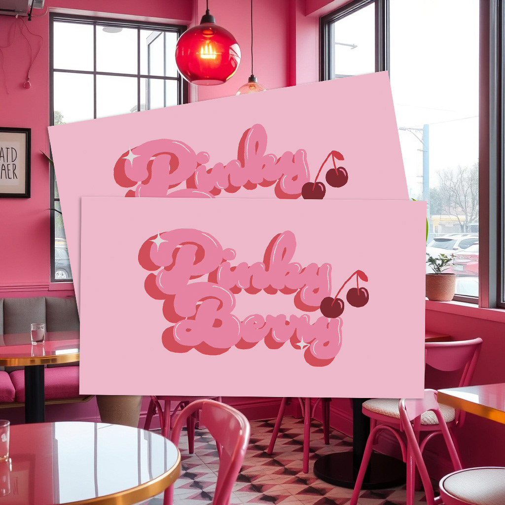
The Pinky Berry logo was inspired by a blend of 70s retro bubble typography and modern girly aesthetics. The lettering is soft, rounded, and full of personality, capturing a playful and approachable tone that reflects the cafe’s fun and friendly vibe. The rich pink tones paired with a bold cherry icon add a sweet, flirty touch, making the logo instantly recognizable and social-media ready. Sparkle accents were added to give it a dreamy, glossy feel, like a cherry on top of a perfect dessert. The goal was to create a nostalgic and trendy logo, perfectly matching the café’s lifestyle-driven identity.
Pattern Design
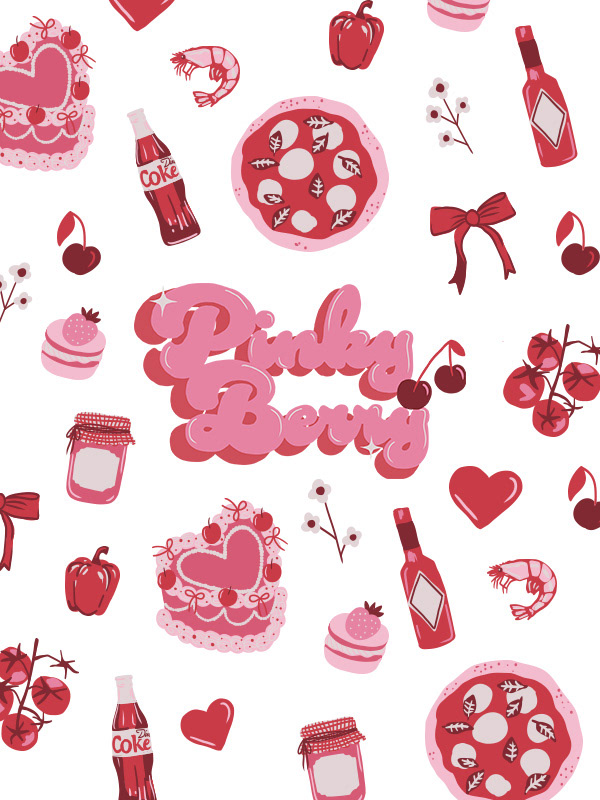
The pattern design builds on the whimsical, charming energy of the brand. It features a delightful mix of illustrated elements in a cohesive pink and red palette. These icons are playful and varied, echoing the joyful experience of stepping into the cafe. Each element was carefully chosen to reflect both the food offerings and the lifestyle mood of Pinky Berry.
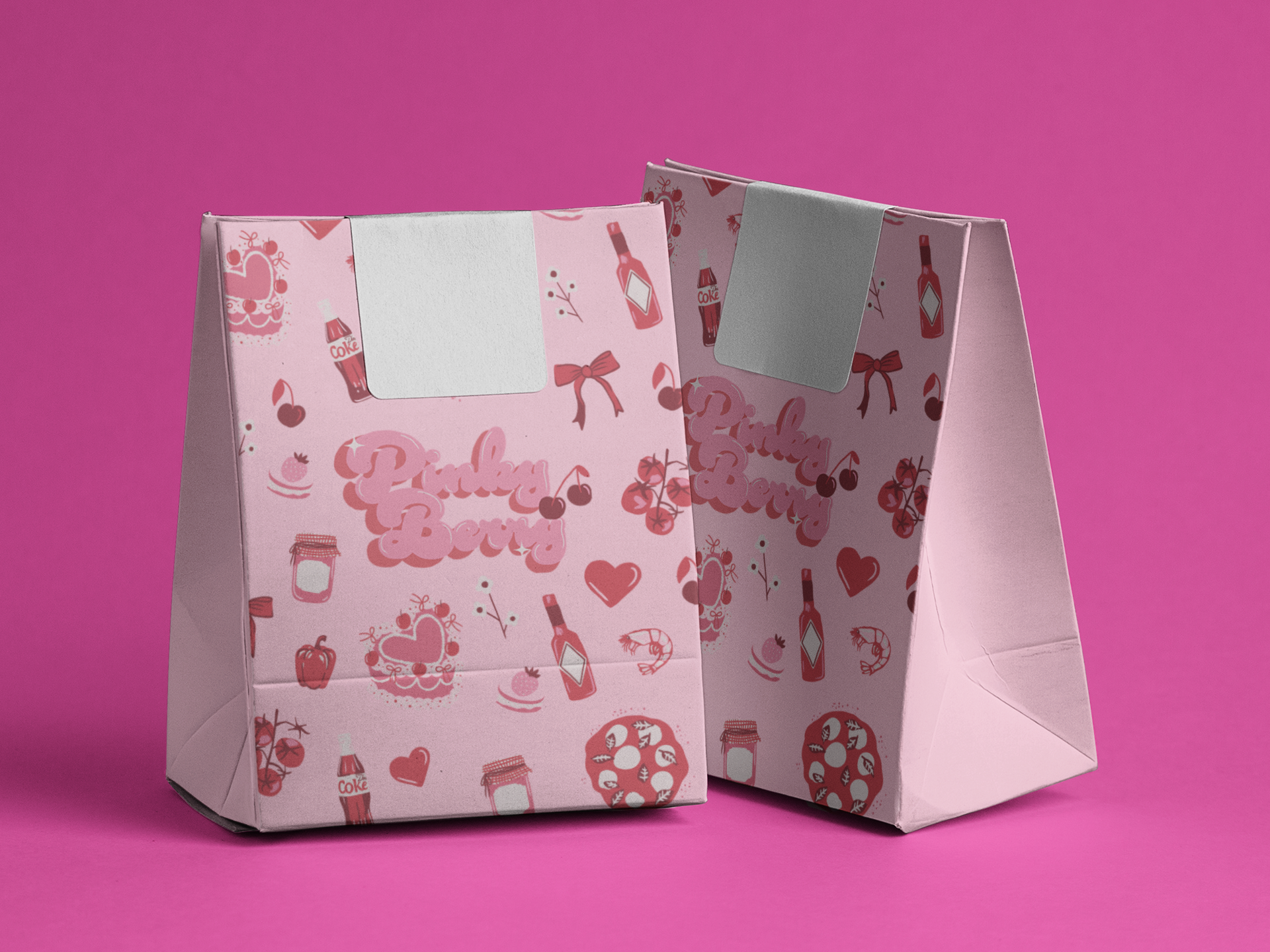
Packaging Design Idea
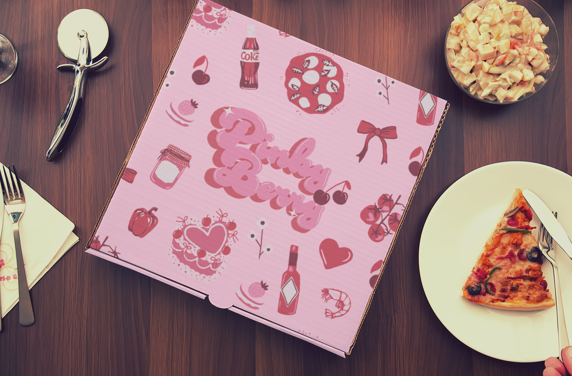
The Pinky Berry pizza box was designed in a vibrant pink tone to instantly catch attention on the street or on camera. The bold colour choice, combined with playful illustrations and a standout logo, creates a fun and girlish look that elevates the unboxing experience. Designed with social sharing in mind, the layout is perfect for flatlays and adds a pop of personality to every slice.